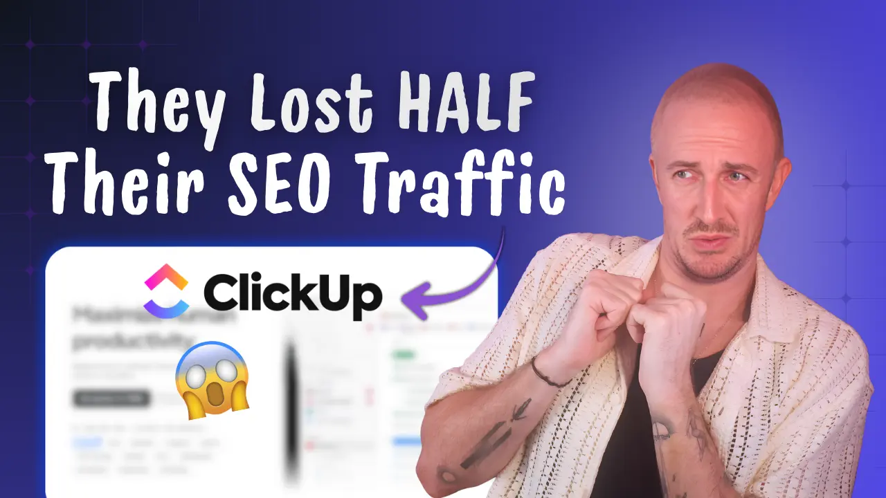
ClickUp Marketing Review: How A $4B SaaS Lost SEO Traffic
Stale, sales-first pages drove a blog collapse from 1.2M visits to 150K.

When I looked into ClickUp‘s SEO and marketing performance, I didn’t expect a company this big to be sliding this hard. ClickUp is valued at around $4 billion, reports more than $300 million in annual revenue, and serves 20+ million customers. Yet over the last 12 months, their estimated SEO traffic got cut in half.
This video and post breaks down what I uncovered in my ClickUp marketing review, including where their 50% traffic drop is coming from, and the on-page and content fixes I’d make… in order to win rankings back and grow their traffic in a completely new (more customer-aligned) direction.

Key Takeaways for Marketers to Learn From
- ClickUp’s estimated traffic fell from ~2.6M/month to ~1.3M/month in less than a year (a major decline).
- A big chunk of their remaining organic traffic appears to come from brand searches, not problem-solving topics where they stand to build real relationships with potential new customers.
- ClickUp’s resource library (guides, playbooks, blog posts, original research) appears mostly outdated and underperforming.
- Their top blog posts often miss the basics: freshness, intent-match, and above-the-fold usefulness.
ClickUp’s 50% Traffic Crash: Big Numbers, Big Risk
ClickUp positions itself as an “AI productivity maximizer” and a suite for solving “work sprawl” (too many tools, too many tabs, too many handoffs). The product bundle includes project management, docs and wikis, dashboards, automations, and even chat.
The scary part of this traffic drop isn’t just the volume. It’s the mix of where they lost all this traffic.
From what I saw, more than half of organic traffic seems to be tied to brand terms. That’s traffic you often get because people already know you.
The long-term risk is simple: If you stop winning “problem to solution” searches, you stop meeting new customers at the moment they’re looking for help.
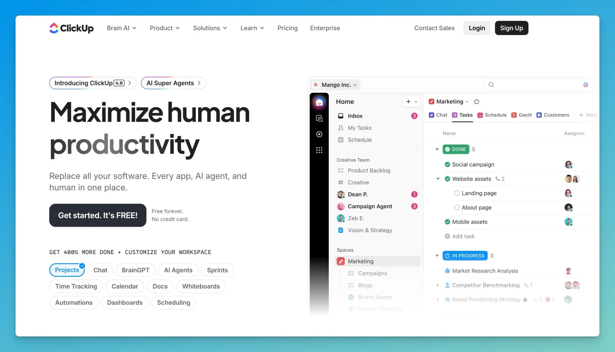
ClickUp’s Homepage: A Strong Start that Gets Too Busy
On the homepage, ClickUp actually does something I respect: They don’t scream “AI” in the main headline. AI is there, but it’s more subtle, with mentions like “AI super agents.”
There’s a lot to like on their homepage:
- Visuals that show real examples of the product in use
- Fun, clear graphics that communicate outcomes
- A call to watch a demo-style video
- A clean UX for such a feature-heavy platform
But the page also feels like it’s trying to sell 12 things at once…
“Build your own agent,” “Try Brain today,” then more calls to action, then more. By the end, there’s even a promise along the lines of “save six to seven days every week,” which reads as unrealistic. I’d rather see a tighter promise tied to a specific role and outcome.
Strong Authority, Weak “AI Visibility” Signals
Using third-party SEO estimates, ClickUp still shows strong domain authority. They also show up in AI-related citations (in Google and in tools like ChatGPT), but the numbers are lower than I’d expect for a company of this size.

More importantly, the trend line is heading the wrong way, and the keyword mix at the top leans heavily toward branded searches. That’s not where durable acquisition comes from.
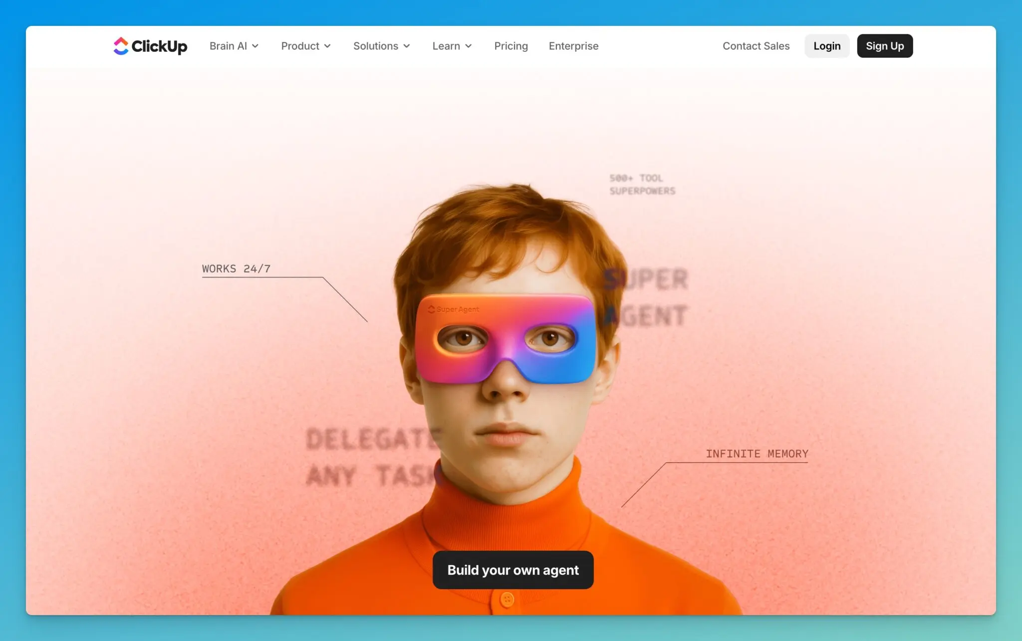
The “Work Sprawl” Microsite is Cool, but Feels Outdated
One of the most creative moves ClickUp made is their “kill work sprawl” content, which lives on a separate domain: sprawl.work

Design-wise, it’s beautiful. It feels like ClickUp’s creative side got room to breathe.
The problem is trust. If you’re publishing research and “state of” reports, and visitors see a lot of “2025” in a world that’s already in 2026, it makes the whole thing feel stale. This kind of page only works when it’s treated like a living asset.
Guides and Playbooks: Confusing UX, Tiny Traffic
When I landed on ClickUp’s guides and playbooks section, the first thing I saw was a call to action to schedule a free consultation.
That’s not always wrong, but it’s confusing in context. On a guides page, I’m not ready for a consultation, I’m ready for answers.
Beyond that:
- A lot of the research looks outdated (“state of AI maturity in 2025” type framing)
- The content tiles look the same, making it hard to scan
- Titles are hard to read and don’t stand out

And performance backs this up. This section is only pulling an estimated 371 visits/month, and it’s basically been stuck in the same 300 to 400 range for over a year.
If I owned this, I’d either cut it or merge it into a single, stronger content hub.
The ClickUp Blog: Nice Layout, but Rankings Fell Off a Cliff
ClickUp’s blog homepage looks good. I like seeing an email capture near the top and a featured post area.

But visually, it feels inconsistent. Different graphic styles sit next to each other, which makes the whole thing feel pieced together over time.
The bigger issue is traffic:
- About a year ago: ~1.185M monthly visits to blog content
- Now: ~150K monthly visits
That’s not a small dip. That’s a crater.
A lot of “winner” posts simply lost rankings, including a “ChatGPT alternatives” post that used to rank around position 3 and slipped to page two.
Example Blog Post Teardown: What’s Working & What’s Not
The example I covered in my video review on ChatGPT alternatives (a guide we have our own analysis on) is the kind of post that should print traffic for a site with such high domain authority, but small mistakes add up fast.

What I didn’t like:
- It was updated recently, but not clearly positioned as a 2026 refresh
- The title and meta title don’t lead with the clearest intent-match phrasing
- The featured visual is a GIF showcasing ClickUp, not the list of alternatives
- There’s a ClickUp CTA above the fold before the content gets going
- The phrase “ChatGPT alternatives” isn’t mentioned early enough in the intro
What ClickUp did well:
- A jump-link table of contents that’s easy to use
- Clean formatting with helpful sections like “limitations” and “what makes a good alternative”
- A chart near the top and links out to tools mentioned
In a “ChatGPT alternatives” list, the top results people expect are tools like Google Gemini, Microsoft Copilot, Claude, and Perplexity.
ClickUp putting itself at #1 feels off because it’s not a standalone LLM chatbot in the way people mean when they search that query. The section also reads heavily promotional, with lots of ClickUp-focused CTAs, videos, and noticeably shorter “limitations” than other tools.
That kind of bias is how you lose trust, and rankings.
What I’d Do Next If I Ran ClickUp’s Content Team
If I were fixing this, I’d go straight at the foundations:
- Audit and prune content that doesn’t match real search intent (and free up crawl budget)
- Consolidate overlapping resources into fewer, stronger hubs
- Build free tools as an SEO engine on top of a strong domain
- Tighten visual consistency across the blog and resource sections
- Update the top posts first, especially anything that’s year-sensitive
For a repeatable way to spot on-page issues like missing intent-match, weak intros, and stale SERP positioning, I’d use something like SEO Reports for Google and AI traffic to systematize updates.
Final Thoughts for ClickUp (and SEO-Minded Marketers)
ClickUp still has a strong product and a clear market need, but their content and SEO execution isn’t keeping up with the brand they’ve built.
The traffic decline shows what happens when helpful content turns into sales-first content, and when updates lag behind the market. If they tighten focus, clean up resource sprawl, and rewrite key posts to serve readers first, they can earn back a lot of that lost visibility.
If you want me to review your website, drop me a comment below!

Article by
RightBlogger Co-Founder, Ryan Robinson teaches 500,000 monthly readers about SEO and online business. He is a recovering side project addict.


New:Site Agent
Automated SEO Blog Posts That Work
Try RightBlogger for free, we know you'll love it.
- Automated Content
- Blog Posts in One Click
- Unlimited Usage


Leave a comment
You must be logged in to comment.
Loading comments...